Building a Learning Platform That Works for Everyone

By Qiushi Yan, Lead Developer
You're preparing for a state licensure exam. You open your study material and find an interactive fill-in-the-blank exercise. You tab into the first blank, type your answer, press Enter, and your cursor jumps to the next one. When you submit, a voice tells you how many you got right.
Now imagine doing all of this with a screen reader, because you can't see the screen.
Does it still work?
That question drives a lot of what we do at iTELL. We build an AI-powered learning platform that turns static text into interactive learning experiences: quizzes, fill-in-the-blank exercises, AI tutoring, progress tracking. Those features are only useful if every learner can actually use them.
What accessibility actually means
Most people hear "accessibility" and think of wheelchair ramps. On the web, it means something broader: making sure the things we build work for people regardless of how they interact with a computer. That includes keyboard navigation, screen readers, color contrast, text sizing, motion sensitivity, and more.
Here's the thing most people don't realize: disability isn't always what you picture. Color blindness affects roughly 8% of men. After cataract surgery, someone might rely on a screen reader for weeks. A construction worker with a broken wrist uses keyboard navigation until the cast comes off. A student with a migraine can't tolerate animations. These aren't edge cases. Across permanent, temporary, and situational conditions, the number of people who benefit from accessible design on any given day is much larger than most teams assume.
And yet, in educational technology, accessibility often gets treated as an afterthought. The learning management systems and training platforms that millions of people depend on frequently fall short of basic standards. We think that's backwards. If your tool is supposed to help people learn, and some of those people can't use it, then it isn't doing its job.
There's an international standard called the Web Content Accessibility Guidelines (WCAG) that spells out what accessible web design looks like. We follow it. But rather than listing compliance checkboxes, I want to show what a few of these principles look like in practice inside iTELL.
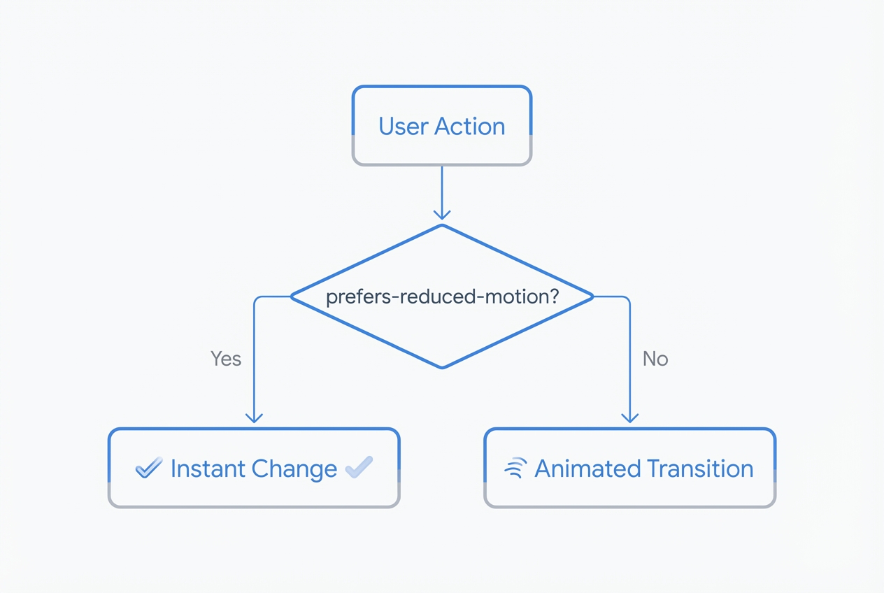
Respecting how you move
Not everyone experiences motion the same way. Animations that feel smooth to one person can cause dizziness or nausea for another. Operating systems have had a "reduce motion" setting for years, and we think every web application should honor it.
In iTELL, we built this into the foundation. When a user has reduced motion enabled, all of our animation durations drop to zero automatically:
@media (prefers-reduced-motion: reduce) {
  :root {
    --chunk-duration-fast: 0ms;
    --chunk-duration-normal: 0ms;
    --chunk-duration-slow: 0ms;
  }
}
This covers every animation on the platform in one place. For features that run through JavaScript (quiz feedback, content transitions, chatbot responses), we check the same preference before triggering any motion.
A good example is our theme toggle. Switching between light and dark mode normally plays a smooth crossfade. But if you prefer reduced motion, the theme just switches. No animation, no transition. Your preference, respected quietly.
Making interactive learning work without a mouse
Static text is inherently accessible. Screen readers have been reading paragraphs for decades. The hard part is interactive features. Our platform is built around activities: fill-in-the-blank exercises, quizzes, AI-generated questions, and a conversational tutoring chatbot called STAIRS. Each one needs to work entirely from a keyboard, and each one needs to communicate what's happening to assistive technology.
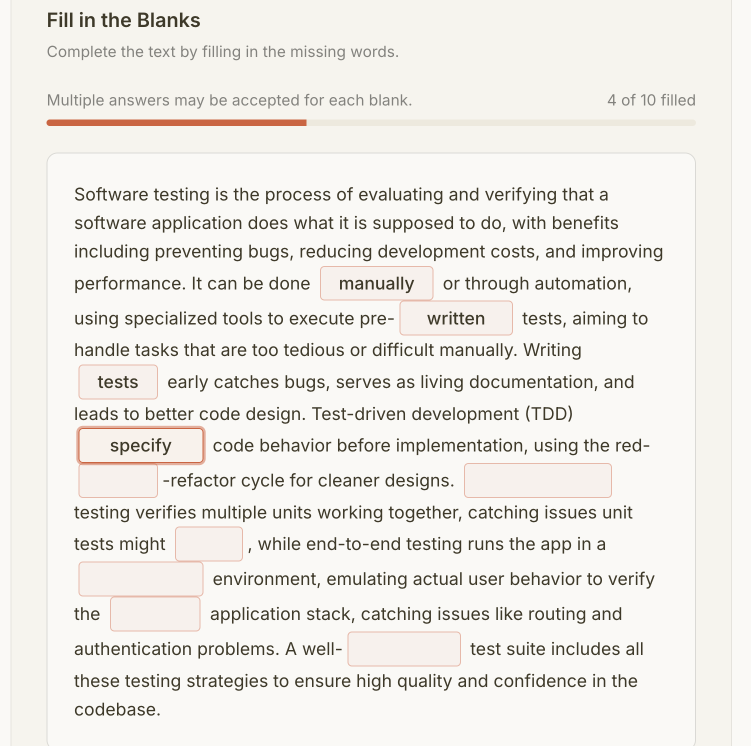
Take our fill-in-the-blank exercises. A learner reads a passage with certain words removed, then types the missing terms into input fields. Here's what the experience looks like:
Pressing Enter in one blank moves focus to the next blank. After the last blank, Enter submits the form. No mouse required. When you submit, your screen reader announces the results: "3 of 5 blanks correct." It waits until the reader finishes speaking before delivering the result, so nothing gets cut off. After submission, focus moves to the results section so keyboard users land right where the feedback is. If you retry, focus goes back to the first blank.
For quizzes, screen readers don't just read a list of disconnected radio buttons. Each question is grouped so users hear "Question 3: Which of the following..." followed by the answer choices in context.
Our chatbot, STAIRS, announces AI responses as they arrive. When the tutor finishes generating feedback on your summary, you hear about it right away. You don't have to go searching for new content on the page.
At the top of every page, there's a skip link. It's invisible until you press Tab, then it slides into view. One more press and you're past the navigation, right at the learning material. Small thing. But if you navigate by keyboard every day, it saves hundreds of unnecessary tab presses.
The details that add up
Accessibility is less about big architectural decisions and more about dozens of small choices. Here are a few we care about.
Our checkboxes and radio buttons are visually small, but their actual tap area is much larger. You don't need perfect aim to check a box on a phone or with limited motor control.
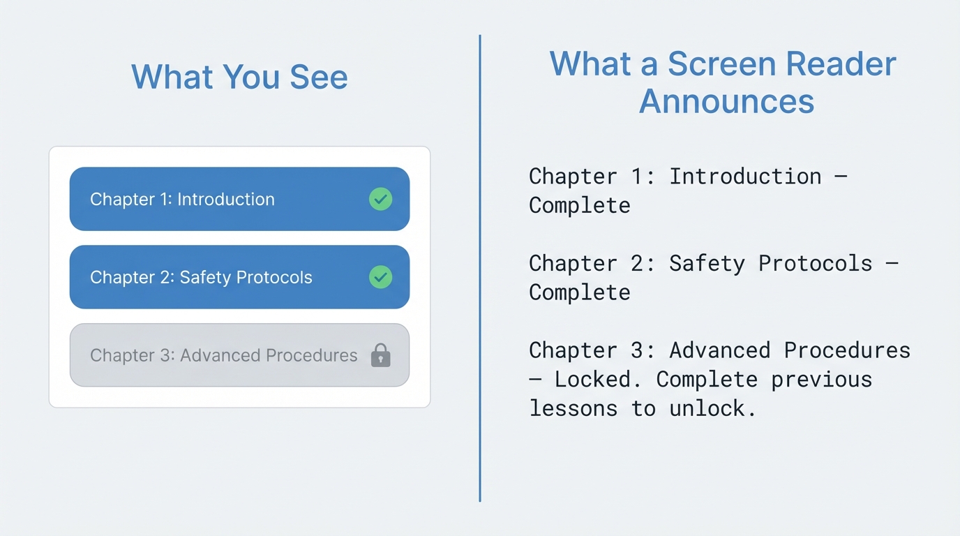
In iTELL, learners progress through content sequentially. You need to complete one section before the next one unlocks. Sighted users see a lock icon. Screen reader users hear: "Locked. Complete previous lessons to unlock." Same information, different channel.
Our progress indicators aren't just colored bars. A screen reader can tell you exactly how far along you are: "Volume progress: 60%." Not just that some visual element exists on the page.
Our breadcrumb navigation tells screen readers which page you're currently on and hides the decorative separators so they don't clutter the announcements.
Form inputs are grouped and labeled properly. When validation fails, error messages are announced immediately so you know what needs fixing without having to hunt for red text.
We're not done
I'm not going to pretend we've solved accessibility. There's always more to find. New features bring new challenges. Browser behavior shifts. Standards evolve.
What I can say is that we don't bolt accessibility on at the end. Every interactive element we build starts with the same questions: Can I reach this with a keyboard? Does a screen reader know what this is? Does it respect the user's motion preferences? Will it make sense without color?
Simple questions. Answering them consistently, across every feature, in every release, is the hard part.